
Applitools captures every breakpoint, the specific screen widths your layout adapts to for mobile, tablet, and desktop, in a single test, so you don't maintain a separate script for each viewport.
Capture mobile, tablet, and desktop viewports in the same test, instead of writing conditional logic for each screen size.
One call to eyes.check replaces the nested if-statements you'd otherwise write to handle each viewport differently.
Visual AI flags where a layout doesn't adapt correctly, an element that overlaps, a menu that doesn't collapse, before a real user hits it.
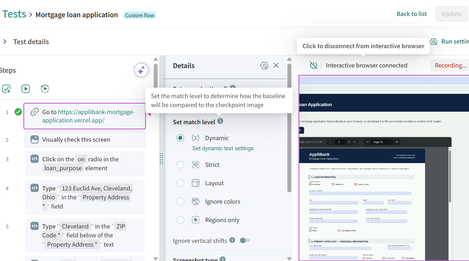
Layout match level
Ignore pixel-level differences between screen sizes and flag only real layout breaks, like an overlapping element or a broken grid.
Every viewport in one test
Capture mobile, tablet, and desktop in a single eyes.check call, instead of scripting a separate check for each.

No per-viewport locators
Visual AI finds elements by what they look like, so a menu that collapses into a hamburger icon on mobile doesn't need its own locator.
One test, not three
Replace the nested if-statements you'd write to handle mobile, tablet, and desktop separately with a single test that runs across all of them.
Run in your existing pipeline
SDKs integrate directly with Playwright, Cypress, Selenium, and Appium, so responsive checks run in the same test you already wrote.
The Ultrafast Grid
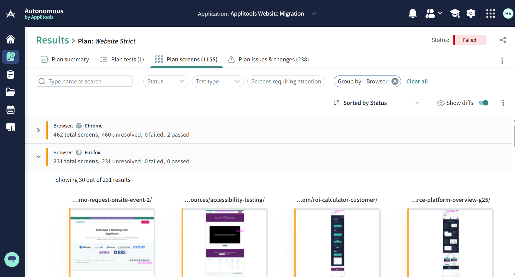
An engine that reproduces each browser and viewport's rendering in parallel, so every breakpoint gets tested at once instead of one after another.
Auto-maintenance
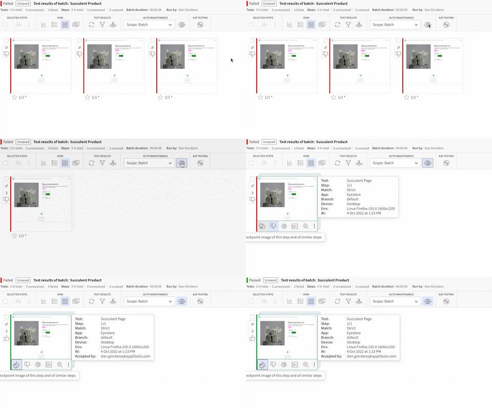
When a layout change is intentional, group every affected viewport and approve the new baseline once.
Root Cause Analysis
See the exact DOM and CSS change behind a diff, so you know if a viewport broke because of your change or because a browser rendered it differently.
Test a responsive component in Storybook or Figma at each breakpoint, before it ships to a full page.
Visual comparisons run locally within your environment. Page snapshots are never sent to an external model or used for training.
Test every breakpoint across real browser engines, not just a resized browser window, so you catch rendering differences a simulated viewport can miss.
The same input always produces the same output at every breakpoint, every run, so a result is something you can explain and trust.
Visual AI ignores rendering noise like anti-aliasing and sub-pixel shifts, and flags only the differences a real user would notice.
Write responsive checks in plain English, record a flow, or write code directly, so design and QA can add coverage without an engineer.
